 Two colours that contrast sharply to someone with normal vision may be far less distinguishable to someone with a vision disorder. Persons with vision disabilities need colours to contrast sharply against the background for them to successfully identify the objects, walls and obstacles. Adequate ‘visual contrast’ is achieved by careful selection of surfaces and materials that not only contrast in colour but also have sufficient luminance contrast between them.
The way to ascertain adequate contrast is to use Light Reflectance Values (LRV). A LRV difference of 30 percent is required between surfaces/ objects for them to be distinguishable by most people with vision impairments. LRV figures can be easily obtained from most suppliers of paints and materials.
Some design guidelines to assist in the orientation and navigation of the visually impaired:
Critical Surfaces: Walls should contrast from ceiling and floor.
Sudden changes in the level: Any sudden changes in levels should be marked with a contrasting colour form the level flooring to warn people with vision impairments.
- Toilets: The sanitary ware in toilets should contrast from the background as should the grab bars.
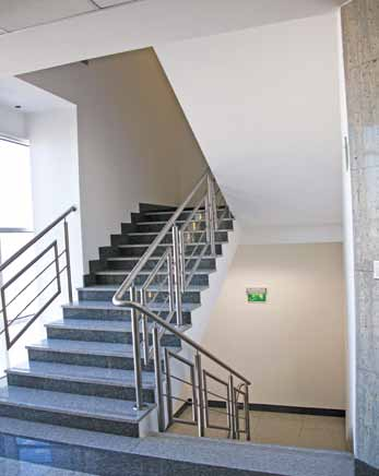
- Stairs: Nosings should be well contrasted from the risers and the treads so that people can easily distinguish between the steps.
- Handrails: Handrails on stairs, ramps and single steps should contrast from the background wall.
- Doors: Doors should contrast from the adjoining wall, door frames should contrast from both the door and the adjoining wall, and door hardware should contrast from the door.
- Switches and sockets: switches, sockets and other operable controls should contrast from the background.
- Skirting: Skirting should, unless it is intended to be used as a handrail, ideally be the same colour or harmonise with the colour of the wall.
- Free standing obstacles: Free standing obstacles such as pillars, furniture and bins should contrast from their background so that people with reduced vision are able to identify these as hazards.
- Signage: Text and symbols on the signage should contrast from the frame and the entire sign frame should contrast from the background.
- Contrasting textures can also be helpful, such as tactile markers that people can identify by feel. Tactile ground surface indicators commonly seen at the edges of railway platforms are a good example of this. Other examples include carpet matting on a vinyl floor surface and domed buttons on handrails to indicate that the end of the stairway or ramp is approaching. Whenever different textures are used, they should also contrast, in colour and tone, to the adjoining/surrounding materials.

Summary
- Adequate ‘visual contrast’ refers to a difference of at least 30 points in the Light Reflectance Value of the two surfaces/ objects.
- Ensure there is adequate visual contrast between:
- Critical Surfaces (walls, ceiling and floor),
- Toilet fixtures and critical surfaces in toilet,
- Nosings and risers/ treads on steps,
- Handrails and background walls,
- Doors and surrounding walls,
- Switches/ sockets and background wall,
- Signages and background sign frame/ wall.
- Highlight obstacles and hazards by incorporating sufficient colour and luminance contrast.
YOU MAY ALSO LIKE…
- Hotel Accessibility Manual – Accessible Parking
- Hotel Accessibility Manual – Main Entrance
- Hotel Accessibility Manual – Corridors
- Hotel Accessibility Manual – Ramps & Handrails
- Accessiable Restaurant, Bar, Pub and Lounge – Hotel Accessibility Manual
- Accessibility Business Centre and Conference – Hotel Accessibility Manual
- Pool Accessibility, Spa Accessibility and Health Club Accessibility
- Accessible Public Restroom Design – Hotel Accessibility Manual
- Accessible Guest Rooms – Hotel Accessibility Manual
- Accessible Bathroom and Shower Room
- Accessible Exterior surfaces and Interior Doors
- Accessible Floor Plans
- Signage
- Accessible Lighting
- Accessible Emergency Egress
Ref : Universal Design India Principles – ITC Hotels