WCAG 2.1 Checklist

The Web Content Accessibility Guidelines (WCAG) improve the accessibility of web content, websites and web applications on desktop computers, laptops, tablets and mobile devices for people with a wide range of disabilities, including auditory, cognitive, neurological, physical, speech and visual disabilities.

WCAG 2.1 Checklist - WCAG 2.1 A, AA, AAA level checklist. 4 Principles, 78 success criteria - 508 ADA, AODA - Digital Accessibility Testing

WCAG 2.1 Highlights

Mobile Apps

• Improves support for touch interactions, keyboard and mouse
• Avoids unintended activation of device sensors

Low Vision

• Extends contrast requirements to graphics
• Improves text and layout adaptability

Cognitive and Learning Disabilities

• Enables more detailed description of page controls and elements to support personalization of user interface

EN 301 549 Coordination

• Harmonized update in progress in Europe
• Particularly for expanded mobile

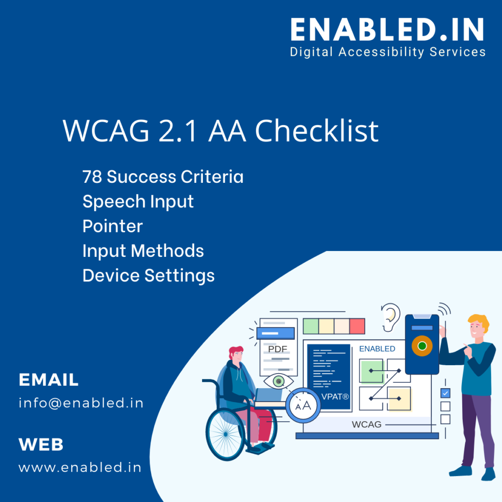
WCAG 2.1 Success Criteria (SC)

LevelWCAG 2.0WCAG 2.1Total SC
A
Basic web accessibility features
25530
AA
Biggest and most common barriers
13720
AAA –
The highest level of web accessibility
23528
Total611778
What’s new about WCAG 2.1 is that it includes 17 new success criteria related to mobile accessibility, as well as provisions that will benefit more people.

WCAG 2.1 Level A Checklist

Success CriteriaDescriptionConsiderable
1.1.1 – Non-text ContentProvide text alternatives for non-text content
  • Always provide alternative options like audio or OTP (one time password) for CAPTCHA.
  • Always provide textual summary or description for complex charts and graphs apart form shot alt text.
  • Always use title attribute for additional info while using alt attribute in image links.
1.2.1 – Audio-only and Video-only
(Pre-recorded)
Provide an alternative to video-only and
audio-only content
  • Provide text transcripts for audio tracks.
  • Provide either text transcript or an audio track for a silent video.
  • If an audio is provided for video then text transcript is not required. (Exception)
1.2.2 – Captions (Pre-recorded)1.2.2 – Captions (Pre-recorded)
  • Provide captions for the video that has audio.
  • If video is the alternative for text content then it doesn’t need captions. (Exception)
  • If possible provide captions in multiple languages as this helps users to choose the language they can follow.
1.2.3 – Audio description or Media
Alternative (Pre-recorded)
Video with an audio has a second alternative
  • Provide audio descriptions if possible or
  • Provide text transcripts for the video.
  • Videos that rely on sound only doesn’t require audio descriptions. Example: interviews, speeches.
1.3.1 – Info and RelationshipsLogical structures2
  • Emphasis – Use <em> and <strong> instead of using Italics and Bold texts to highlight important texts; use <blockquote> to mark quotations
  • Headings – Provide hierarchically logical heading markup for the contents
  • Table – Provide HTML table markup and provide column headers for simple tables and column headers and row headers for complex tables
  • Table – When using nested tables, consider the possibility of breaking the content into logical individual tables instead of nested tables
  • Forms – Provide programmatic association of visible labels or appropriate accessible names to all the form elements
  • Lists – Markup the contents that logically fall into list as ordered or unordered list. Do not put huge text blocks which is otherwise are paragraphs ass lists
  • Grouping – Provide grouping and group level labels to mark a group of form elements like radio buttons or checkboxes; use <fieldset> and legend to achieve grouping and group level association for native form elements; use ARIA to achieve the same where custom form controls are used
  • Use native semantic markup frequently and ARIA sparingly.
1.3.2 – Meaningful SequencePresent content in a meaningful order
  • Make sure that content presented on the page is logical & intuitive.
  • Write HTML first & then manage design with CSS.
  • Make sure visual order matches the DOM order.
  • Use headings, lists, paragraphs etc to mark your content.
  • Make sure your users can differentiate the navigation menus from main content.
1.3.3 – Sensory CharacteristicsUse more than one sense for instructions
  • While using shape and or location, provide visible labels/names to the controls
  • When combining color and shape/size/location/orientation, provide off-screen text for screen reader users
  • When using sound as a clue, combine it with text/color based clues.
1.4.1 – Use of ColourDon’t use presentation that relies solely on colour
  • Don’t use color as sole method to convey information.
  • Make sure instructions/prompts provided in text don’t refer to color alone.
  • Make sure instructions are provided in text for graphs & charts where color is used to convey information.
  • Provide more than one visual clue that include common icons and colors to differentiate texts and user interface elements.
1.4.2 – Audio ControlDon’t play audio automatically
  • Don’t play audio automatically if possible.
  • Make sure your audio is less than 3 seconds.
  • If audio is more than 3 seconds then provide a pause/stop or a mechanism to control the audio player volume from the overall system volume.
  • Make sure that focus is on the pause/stop or volume control as soon as page opens if audio is playing automatically.
2.1.1 – KeyboardAccessible by keyboard only
  • Make sure all elements on the page buttons, links, form controls etc. are reachable by tab key.
  • Make sure that users are able to activate the buttons, links & form controls using the enter and/or spacebar keys.
  • Write clean HTML & CSS as it is keyboard operable by default & doesn’t require any special tweaks.
  • Make sure that there is a visible focus for all the active elements on the page.
  • Make sure that focus order is logical & intuitive.
  • Provide tabindex=0 for custom UI elements so that they are focusable.
  • Provide appropriate event handlers for custom scripted elements so that they are operable by their respective keys.
  • Avoid access keys if possible. If not, at least, ensure they don’t conflict with the user agent and/or AT shortcut keys.
  • Make sure that there is no time limit to perform any action using the keyboard when more than one key is required to operate a control.
2.1.2 – No Keyboard TrapDon’t trap keyboard users
  • Make sure that users can tab to & away from all parts of the site.
  • If a user is trapped on a portion of the web page for a purpose, a clear instruction must be provided for the user to end that keyboard trap.
  • Check if all parts of the site is operable using only keyboard, test by unplugging the mouse.
  • Stick to standard navigation as much as possible like tab, shift+tab & arrow keys.
  • If custom keystrokes are provided to operate a control make sure hints are exposed to all users.
  • Make sure your third party widgets are accessible, most of the time they cause major keyboard operability issues.
2.1.4 – Character Key ShortcutsDo not use single key shortcuts or provide a way to turn them off or change them
  • Don’t use single character key shortcuts if possible.
  • Provide a mechanism to turn off the character key shortcuts.
  • design all the keyboard shortcuts with the combinations of non-printable keys.
  • Let the user trigger the shortcut key only when the element has keyboard focus.
2.2.1 – Timing AdjustableTime limits have user controls
  • Provide a control on the landing page for the user to initiate a longer session time or no session timeout.
  • Provide a way for the user to turn off the session time out.
  • Provide a means to set the time limit to 10 times the default time limit.
  • Prompt the user with help of a pop-up or modal so that enough warning is available for the user to reset the time limit.
  • Make sure controls provided to extend the time limit are keyboard operable.
  • Moving, scrolling and/or blinking content must have mechanism to pause or stop the movement or scroll or blink.
  • Auto updating content must be provided with feature to extend the time limit to 10 times of its actual update frequency.
2.2.2 – Pause, Stop, HideProvide user controls for moving content
  • Avoid moving, blinking scrolling content if possible.
  • Content should not blink more than 3 times per second, if it does blink 3times per second then it is considered as flashing & will fail WCAG.
  • Auto updating content should be provided with a pause button or provide a mechanism for the user to specify when the update can happen.
  • If the entire page contains moving, blinking, scrolling & auto updating content then pause, stop or hide buttons are not required as there is no parallel content.
  • Animation that conveys the users that a page or content is loading doesn’t require to meet this success criterion.
2.3.1 – Three Flashes or BelowNo content flashes more than three times per second
  • Avoid flashing content completely if possible.
  • Make sure that flashing content doesn’t flash more than 3 times per second.
  • Use PEAT to confirm if the flashing content passes this check point.
2.4.1 – Bypass Blocks
  • Provide a skip link on top of the page to skip navigational menus.
  • Provide skip links to navigate to content on a large page.
  • Make sure that skip link is visible when it receives focus.
  • Make sure that purpose of the link is clear, provide skip link text as skip to main content or skip navigation etc.
  • When providing ARIA landmarks, ensure multiple landmarks of the same type is not provided.
  • If provided, ensure to use aria-label to assign unique names to such landmarks
    “Primary navigation”, “secondary navigation” etc.
2.4.2 – Page TitledHelpful and clear page title
  • Provide a unique title.
  • Make sure that title is between 50-75 characters.
  • Make sure title of the page is the heading level H1 on the page.
  • Title should contain web page name, bit of description & site name.
  • Make sure title describes purpose of the page.
2.4.3 – Focus OrderLogical Order
  • Avoid using tabindex values that are >1 to manage focus order as they may supersede logical tab order
  • Align the focus order with the reading order as much as possible in order to maintain a logical and intuitive navigation of the content. Too much deviation would put a lot of users with disabilities into confusion
2.4.4 – Link Purpose (In Context)Every link’s purpose is clear from its context
  • Let the purpose of the link be clear just by the link text alone! E.G. “My Blog”, “Visit our Blog”.
  • Ensure appropriate alt text is provided when only an image stands as a link.
  • Avoid ambiguous links like “here” or “click here”. If they are required make sure that they are placed at the end of the sentence or paragraph so that they are understood from context.
  • Do not duplicate the alt text and the link text when there is an image and the link adjacent to each other and convey the same info or lead to same destination. Rather, wrap the image with the link and provide alt=”” for the image.
  • Ensure Links having the same link text leads to same destination.
2.5.1 – Pointer GesturesUsers can perform touch functions with assistive technology or one finger
  • Do not use multi-pointer or path based gesture as a sole method to control content
  • Provide single tap or double tap/click as alternatives
  • Always have in mind that one mode does fit for all.
2.5.2 – Pointer CancellationThis requirement applies to web content
that interprets pointer actions
  • Ensure down event alone does not execute any functionality
  • Ensure Up event reverses or un-does any down event based action
  • Ensure a mechanism is available to confirm the performed action where down event executes such action
2.5.3 – Label in NameThe name contains the text that is presented visually
  • Ensure the accessible names like aria-label and alt attribute contain the exact match of the visible label
  • Ensure the visible label text and accessible name text are not interspersed
  • Ensure the accessible name starts exactly with the visible name.
2.5.4 – Motion ActuationFunctions that are trigged by moving a device or by gesturing towards a device can also be operated by more conventional user interface components
  • Provide alternatives where motion actuation is used
  • Provide confirmation or cancelling mechanism
  • Allow system settings to deactivate motion detection
3.1.1 – Language of PagePage has a language assigned
  • Ensure each page of your web site has lang attribute
  • Ensure the language code is correct
  • Use appropriate language tokens in terms of language variations like lang=”en-us” for English in US and lang=”en-uk” for English in Britain.
3.2.1 – On FocusElements do not change when they receive focus
  • Ensure that no element changes by receiving focus.
  • We should avoid both visual & behavioral modifications to page.
  • A website built using only HTML & CSS will not have on focus by default, one needs to provide this through scripting.
  • One way to test this check point is to unplug the mouse & navigate the page using the keyboard.
3.2.2 – On InputElements do not change when they receive input
  • Make sure that forms don’t submit on input of data.
  • Make sure that focus doesn’t move to next form control once a form field is populated with data.
  • Provide a submit button for all forms.
  • Make sure that control of how data is populated is in the hands of your users.
  • If there is a change of context, then provide an instruction that is available for all user groups.
3.3.1 – Error IdentificationClearly identify input errors
  • Make sure that errors are in text.
  • Don’t just use color or visual cues to point out form errors.
  • Use aria-describedby to bind the form control with the error programmatically.
  • Don’t disable the submit button! Some websites disable the submit button & will only enable it if the form is filled appropriately. This is bad practice.
  • Provide necessary instructions & be as specific as possible with the errors so that users can take necessary action.
  • Make sure that errors are distinguished from the regular text on the web page.
3.3.2 – Labels or InstructionsLabel elements and give instructionswcag2.1-level-A-checklist
  • Always provide visible labels to every form fields and controls
  • Provide instructions where the form fields require specific data or format
  • Ensure the labels identify the fields clearly
  • Do programmatically associate the labels with their respective fields
  • Provide group level labels and associate them with the group of form fields where the user input is required in more than one field like phone number or credit card number; also ensure to provide individual labels through title attribute in such scenarios.
4.1.1 – ParsingNo major code errors
  • Use unique ids
  • Nest elements according to their specification
  • Avoid duplicate attributes
  • Make sure that HTML has both start & end tags.
4.1.2 – Name, Role, ValueBuild all elements for accessibility
  • Use native HTML elements wherever possible
  • USE WAI-ARIA attributes while constructing custom component widgets
  • Make sure custom widgets are keyboard operable using spacebar or enter keys
  • Provide tabindex=0 for custom widgets so that they receive tab focus
  • Make it a practice to read ARIA specifications to understand the implications and the consequences of ARIA roles, states and properties before using them

WCAG 2.1 Level AA Checklist

Success CriteriaDescriptionConsiderable
1.2.4 Captions (Live)Live videos have captions
  • Provide captions for a live broadcast
  • Use media players or broadcast platforms where live captioning is supported.
1.2.5 Audio Description (Prerecorded)Users have access to audio description for video content
  • Provide audio descriptions where visual aspect is not explained in the dialog of the video
  • The audio description can either be separate from the original video or be an integral part of the video
  • Audio description must include scene changes, settings, actions that are described in dialogues and any other visual information that is not conveyed via a speech or dialog
  • Use media players that support audio descriptions.
1.3.4 OrientationRequires authors not to rely on a screen orientation
  • Don’t restrict your application or website to just work in landscape or portrait mode.
  • Make sure to honor the device settings while displaying the application in landscape or portrait mode.
1.3.5 Identify Input PurposeEnsure common names are provided using the HTML autocomplete list
  • Provide programmatically determinable input purpose
  • Use appropriate token values while using autocomplete attribute
  • Do not use autocomplete on input fields that does not ask for user data.
1.4.3 Contrast (Minimum)Contrast ratio between text and background is
at least 4.5:1
  • Develop the style guide in such a way that all the texts that are crucial meet the minimum contrast
  • Choose color schemes that are contrastive enough for everyone to see and read
  • Provide a “Contrast” mode with the help of alternative CSS if you can’t
    Design and develop the content with the minimum contrast requirement.
1.4.4 Resize textText can be resized to 200% without loss of content
or function
  • Where browsers do not support or provide zoom functionality (IE6 as an example), provide alternative CSS for scaling purpose
  • When zoomed to 200%, ensure there is no much of horizontal scrolling ( a best practice)
  • Where lengthy user interface components or content like subject line of an email is there, truncate and provide ways along with the instructions to access the content.
1.4.5 Images of textDon’t use images of text
  • Use CSS styled headings instead of Bitmap images
  • Provide site-wide controls to customize the images of texts when there are dynamically generated images of texts
  • Use CSS to specify spacing, alignment, color and the font family of any UI elements, their texts and icons, quotations etc
  • Use keyboard generated symbols wherever possible instead of making them as images.
1.4.10 Reflow


Your website must be responsive


  • Use Responsive Web Design (RWD) from the conception of design itself
  • Use accessible links, modals, toggle type elements to show or hide content
  • Avoid horizontal scroll bars in 400%zoom
  • Avoid content overlaps, clipping, content loss and functionality loss.
1.4.11 Non-text Contrast High contrast between pieces of text and them
backgrounds
  • Ensure hit-areas and focus indicators have 3:1 contrast ratio with their inner or outer background
  • Ensure the checked/unchecked states meet the 3:1 ratio against their adjacent color in order to distinguish the states
  • Ensure parts of graphs and charts where color is the only way to decipher the information, the contrast ratio is met against adjacent colors
  • Ensure appropriate color combinations are chosen and defined for UI elements and other graphical objects in the style guides and the design documents in order to avoid uncomfortable retrofitting.
1.4.12 Text SpacingText spacing can be overridden to improve the reading experience
  • Don’t use fixed containers in your CSS styles.
  • Make sure that content reflows without overlapping or text cut-offs
  • Use relative units of font size, line height, spaces between characters, words, lines and paragraphs
1.4.13 Content on Hover or FocusEnsuring content visible on hover or keyboard focus does not lead to accessibility issues
  • Provide a method to dismiss the additional content that appear on hover or keyboard focus.
  • Make sure that content is present until the user moves away the mouse pointer from the triggering element or content block.
  • Make sure that experience is persistent.
2.4.5 Multiple WaysOffer several ways to find pages
  • More than one way must be available to meet this success criteria
  • Though breadcrumb is quite old, it still works if the users want to go back in a process or a layered structure
  • Search function is most powerful to achieve faster navigation.
  • Menus may become larger and cumbersome; still they work wonders when you look up for a category.
2.4.6 Headings and LabelsUse clear headings and labels
  • Headings must be clear, concise & descriptive
  • Headings must follow a sequential order to avoid confusion.
  • Ensure that headings are consistent throughout the site
  • Ensure that labels are descriptive enough so that users can take necessary actions
2.4.7 Focus visibleKeyboard focus is visible and clear
  • Let browsers handle the visible focus for active elements
  • ensure that active element is provided with visible focus.
  • Ensure that when the user is navigating through the page using keyboard visible focus moves along for every element presented on the page
  • Ensure that there is sufficient contrast between the visible focus & the background of the element, for example if the visible focus is black & the background of the element is black then focus visible is not visually distinguishable.
3.1.2 Language of partsTell users when the language on a page changes
  • Ensure to use appropriate language code (lang=”fr”) wherever the text is in other language
  • Ensure appropriate language token is used in the lang attribute (lang=”pt-br”).
  • Beware of the exceptions too.
3.2.3 Consistent NavigationUse menus consistently
  • keep navigational menus in the same location.
  • present the navigational menus in the same order on all pages.
  • Represent all the standard elements like logo, search functionality, and skip links etc. in the same location on all the pages.
  • using a standard template will help achieve to pass the success criteria of 3.2.3 consistent navigation.
3.2.4 Consistent IdentificationUse icons and buttons consistently
  • Icons & images that are used repeatedly and provide the same function must be provided with same alternative text.
  • Elements with same function are named & labelled consistently.
  • Use icons/images that are consistent. For example print, twitter, Facebook etc.
  • Images will have different meaning in different context, so will need different alternative text depending on the context.
3.3.3 Error SuggestionSuggest fixes when users make errors
  • Provide descriptive errors
  • Provide visible hints that will enable the users to avoid errors during form submissions
  • Associate the errors with form controls using aria-describedby
  • Move the focus to the form control that has the error once validation failed, this reduces the number of key strokes
  • Mark the required fields with asterisk visually & programmatically with aria-required.
3.3.4 Error Prevention (Legal, Financial, Data)Reduce the risk of input errors for sensitive data
  • Make sure proper hints are provided to fill the data in the forms
  • Provide a review information screen where user provided information is populated
  • Provide a checkbox where user can confirm that they have reviewed all the information and they are ready to submit; enable the submit button only when user checks the checkbox
  • Provide confirmation screen or dialogue when users delete any data.
4.1.3 Status MessagesDistances between paragraphs, rows, words
and characters must be able to be increased to
a certain value
  • Ensure all success toasts and error messages are announced by screen reader
  • Do not fill the pages with live regions. Decide which is an important update and qualifies a status message intelligently
  • Ensure focusable messages are not considered as status messages.

WCAG 2.1 Level AAA Checklist

Success CriteriaDescription
1.2.6 – Sign Language
(Pre-recorded)
Provide sign language translations for videos
1.2.7 – Extend Audio Description
(Pre-recorded)
Provide extended audio description for videos
1.2.8 – Media Alternative
(Pre-recorded)
Provide a text alternative to videos
1.2.9 – Audio only (Live) Provide alternatives for live audio
1.3.6 – Identify Purpose
Anticipates the release of cognitive metadata to be used with assistive technology to simply interfaces
1.4.6 – Contrast (Enhanced) Contrast ratio between text and background is at least 7:1
1.4.7 – Low or No
Background Audio
Audio is clear for listeners to hear
1.4.8 – Visual Presentation Offer users a range of presentation options
1.4.9 – Images of Text
(No Exception)
Don’t use images of text
2.1.3 – Keyboard (No Exception) Accessible by keyboard only, without exception
2.2.3 – No Timing No time limits
2.2.4 – Interruptions Don’t interrupt users
2.2.5 – Re-authenticating Save user data when re-authenticating
2.2.6 – Timeouts Users need to be warned of the duration of any inactivity that could cause data loss
2.3.2 – Three Flashes No content flashes more than three times per second
2.3.3 – Animation from Interaction Motion animation triggered by interaction can be disabled
2.4.8 – Location Let users know where they are
2.4.9 – Link Purpose (Link Only) Every link’s purpose is clear from its text
2.4.10 – Section Headings Break up content with headings
2.5.5 – Target Size The size of the target for pointer inputs is at least 44 x 44 CSS pixels
2.5.6 – Concurrent Input
Mechanisms
Web content does not restrict use of input modalities available on a platform
3.1.3 – Unusual Words Explain any strange words
3.1.4 – Abbreviations Explain any abbreviations
3.1.5 – Reading Level Users with nine years of school can read your content
3.1.6 – Pronunciation Explain any words that are hard to pronounce
3.2.5 – Change on Request Don’t change elements until users ask
3.3.5 – Help Provide detailed help and instructions
3.3.6 – Error Prevention (All) Reduce the risk of all input errors

How Enabled.in helps your Website Accessibility

Enabled.in’s accessibility services take care of all kinds of compliance issues for you. From the backend through the frontend, making sure that your site is fully compliant with ADA and WCAG is our standard.

With Enabled.in accessibility testing framework, website owners can effortlessly reach compliance with WCAG 2.1, ADA, ATAG 2.0EN 301-549 and Section 508 regulations, as required by any governmental and regulatory bodies.

We strive to include Individuals with Disabilities in the accessibility testing process. As a result, we are able to deliver future-proof mobile app accessibility solutions.

Contact info@enabled.in

Connect with an Accessibility Expert

    Connect with an Accessibility Expert today

    We're here to assist you. You can ask us anything, whether it's about how to get started on your digital accessibility journey or if you'd want a free compliance test of your site.