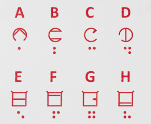
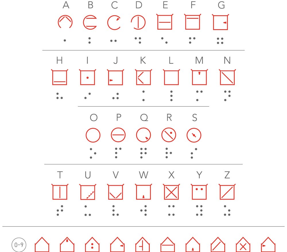
 ELIA Frames™ leverages modern tactile printing technology and design principles to optimize each letter’s design and create easily identifiable characters. Each letter features an outer frame (circle, square, house) and interior elements that suggest the main characteristics of each standard alphabet letter.
Elia Frames, a tactile alphabet for visually impaired people, more intuitive and accessible than braille!
This is the revolutionary idea of Andrew Chepaitis, President of elia life technology.
Andrew Chepaitis, an American entrepreneur created ELIA Frames a new tactile alphabet more intuitive and accessible than braille. While only 1% of the visually impaired and 15% of the blind would be able to read Braille due to complex learning, ELIA Frames aims to replace it.
The ELIA Frames™ explained with A Letter

A has a circular frame with an opening in the bottom portion of its frame. It is the only ELIA letter with an opening in the bottom of the frame. Inside the frame, A has a peaked symbol similar to a Roman capital letter A, or an upside down V. The Circular dot to indicate Capital Letter A and the Circular without dot to indicate to small letter.
Based on the Roman alphabet, ELIA Frames™ is intuitive to learn.
The ELIA Frames™ font is designed for maximum tactile discrimination by people who have a visual impairment. It is so easy to learn that it can be studied and applied in as little as 2 hours. And because ELIA Frames™ is based on the standard Roman alphabet, it can be read visually by those with full sight (teachers, caregivers or co-workers).
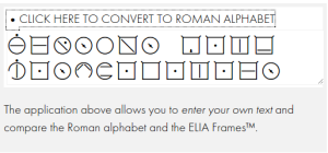
ELIA Frame Website : http://www.theeliaidea.com/