Signage is an important element in a building and provides various kinds of communication to visitors in a space. Signage that is effective benefits everyone. It also enables people with visual and hearing impairments and people with learning difficulties to use the environment as independently as possible. Signage provided at the right place reduces the effort required in wayfinding for guests, visitors and staff.
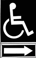 Directional
Enable people to find destinations and often include arrows or other directional text. In large buildings they may contain more than one location and care should be taken to ensure that the directional arrows are easily read.
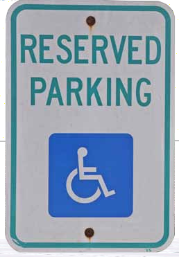
Information
These are the signs that people use to orientate themselves when they first reach a building: name sign, car park, entrance and the main locations within the buildings.
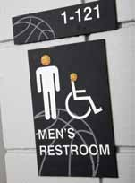 Identification
These are used for individual locations and usually indicate a particular room or service.
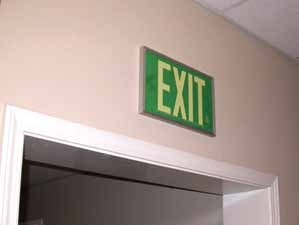
Instructive
Provide instructions on how to use the space. Health and safety – These include essential signs such as fire exits, warning signs etc.
Good Signage Tips:
- In a sans serif font
- Large enough to see at a distance
- Ranged left for ease of reading (if a directional arrow pointed left it would be ranged right)
- Directional arrow near enough to follow easily
- Good colour contrast
- Signage must be clear, concise and consistent.
- The information provided must be well thought through and precise.
 The Language of Signs
What is said on a sign and how it appears is very important.
- Words used should be readily understood;
- Abbreviations must be avoided
- Be consistent with the terminology;
- Only give as much information as is needed at that point in time – supplementary signs can be used further along the route if necessary;
But also ensure that the meaning is conveyed and not misleading through trying to make the sign too concise. At times, signs may be misleading because of the language or symbol used.
Sign Style
- Capitals and lower case should always be used. The use of all capitals can cause difficulty in reading quickly for many
- people. (The exception of course is for the traditional well recognised: EXIT, TAXI etc);
- Typefaces should always be sans serif: such as Helvetica Medium, Ariel, Avant Garde, Futura;
- Try not to use full stops or commas, if you have names on signs print them out as: Dr K Singh
- Sometimes symbols can be used instead of words such as for first aid, no smoking, and recognised symbols for disability;
- Arrows are always useful but ensure they are the right type; ISO 7001 recommend using arrows whose ends are parallel with the main stem. Avoid arrows that have a short tail, are thin so making them difficult to see and shaped arrows that are not immediately recognisable;
Always avoid
- Italics or scripts;
- Exaggerated typefaces;
- Very bold typefaces where the white space inside letters disappears;
- Too much information on a sign;
- Lots of different typefaces on a sign.
Colours
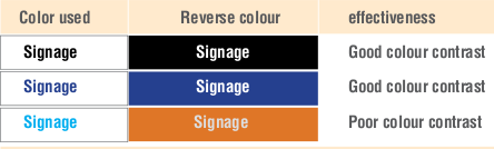
Colour of the sign makes little difference to a sighted person, but it is of significant consequence to people with vision impairments. Equally important is whether signs are embossed or rendered in Braille
Size of Signs
Viewing Distance | Size |
| Up to 7mm | 60mm x 60mm |
| 7mm – 8mm | 100mm x 100mm |
| Exceeding 8mm | 200mm x 200mm to 450mm x 450mm |
Size of Letters in Signs
Viewing Distance | Size |
| 2000mm | 6mm |
| 3000mm | 12mm |
| 6000mm | 20mm |
| 8000mm | 25mm |
| 12000mm | 40mm |
| 15000mm | 50mm |
| 25000mm | 80mm |
| 35000mm | 100mm |
| 40000mm | 130mm |
| 50000mm | 150mm |
Embossed signs
 These signs are always read close up and it is essential that they are clear, brief and unambiguous. They should be positioned between a height of 1400mm and 1700mm. The text should be embossed within a range of 1 to 1.5mm and never engraved.
Signage must be provided on the left side of the wall and not the door as the door can be often open and thus the signage missed
- Numerals are better to recognise than using words and take up less space;
- The spacing between lines is very important. Visually impaired people need more clear space to read something easily, so ensure that the text is not too close together;
- Highly polished or reflective material should be avoided to reduce glare;
- Braille and embossed signs for visually impaired people should be provided;
- Care should also be taken with arrows to ensure that there is not too much space between the words and the arrow, which would make visual alignment difficult.
 Where should they be placed?
General directional signs: these should be placed between heights of 1400mm and 1700mm from the furnished floor surface. They should be repeated along any long lengths of travel and at any intersection.
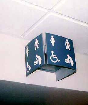
Hanging signs
Signs that are placed at right angles to the wall or hanging from the ceiling, the bottom of the sign should be 2300mm from the floor level.
Floor Level indicator signs
These should be placed 1400mm from the bottom of the sign, opposite lifts, on stairwells and opposite doors from stairwells.
Reception desks
These should be preferably at the front of the desk for wheelchair users and either suspended from the ceiling or at 1400mm from the floor level.
Lifts/ toilets etc
In a large building it is useful if signs immediately outside the facility are placed at right angles to the wall for easy recognition. This is supplementary to the signage leading to the facility and the usual signage on doors.
Summary
- In a sans serif font, font size relative to viewing distance.
- Use ‘Title Case’ (not ‘Sentence case’ or ‘UPPERCASE’)
- Ranged left for ease of reading (if a directional arrow pointed left it would be ranged right)
- Directional arrow near enough to follow easily
- Good colour contrast
- Signage must be clear, concise and consistent
- The information provided must be well thought through and precise
- Incorporate raised letters and standard pictograms
YOU MAY ALSO LIKE…
- Hotel Accessibility Manual – Accessible Parking
- Hotel Accessibility Manual – Main Entrance
- Hotel Accessibility Manual – Corridors
- Hotel Accessibility Manual – Ramps & Handrails
- Color and Luminance Contrast – Hotel Accessibility Manual
- Accessibility Business Centre and Conference – Hotel Accessibility Manual
- Accessiable Restaurant, Bar, Pub and Lounge – Hotel Accessibility Manual
- Pool Accessibility, Spa Accessibility and Health Club Accessibility
- Accessible Public Restroom Design
- Accessible Guest Rooms
- Accessible Emergency Egress
- Accessible Exterior surfaces and Interior Doors
- Accessible Floor Plans
- Accessible Lighting
- Accessible Bathroom and Shower Room
Ref : Universal Design India Principles – ITC Hotels