VPAT ACR Mobile App Accessibility Compliance – As mobile products expand into the European market, accessibility is no longer optional. Beyond ethical responsibility, organizations must now meet legally binding accessibility requirements. Understanding the alignment of Mobile Accessibility: From Empathy to Action with European standards is crucial. This understanding helps teams shift from good intentions to compliant and scalable execution.
The European Accessibility Act (EAA): What It Means for Mobile Products
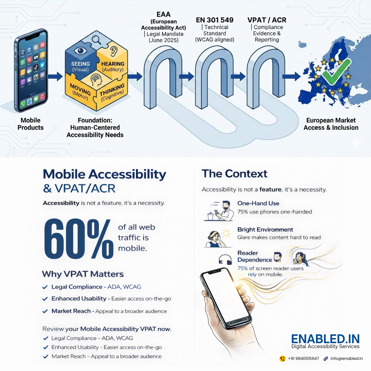
The European Accessibility Act (EAA) establishes accessibility requirements for key digital products and services. These products and services are sold or used within the European Union. This includes:
- Mobile applications
- E-commerce platforms
- Banking and financial services
- E-books and digital content
- Operating systems and consumer software
The EAA applies to private-sector organizations operating in or selling into the EU. From June 2025 onward, covered products must be accessible by law.
This aligns directly with the empathy-driven approach outlined throughout this guide: accessibility is measured by real usability, not theoretical compliance.
Understanding the Mobile Accessibility Imperative
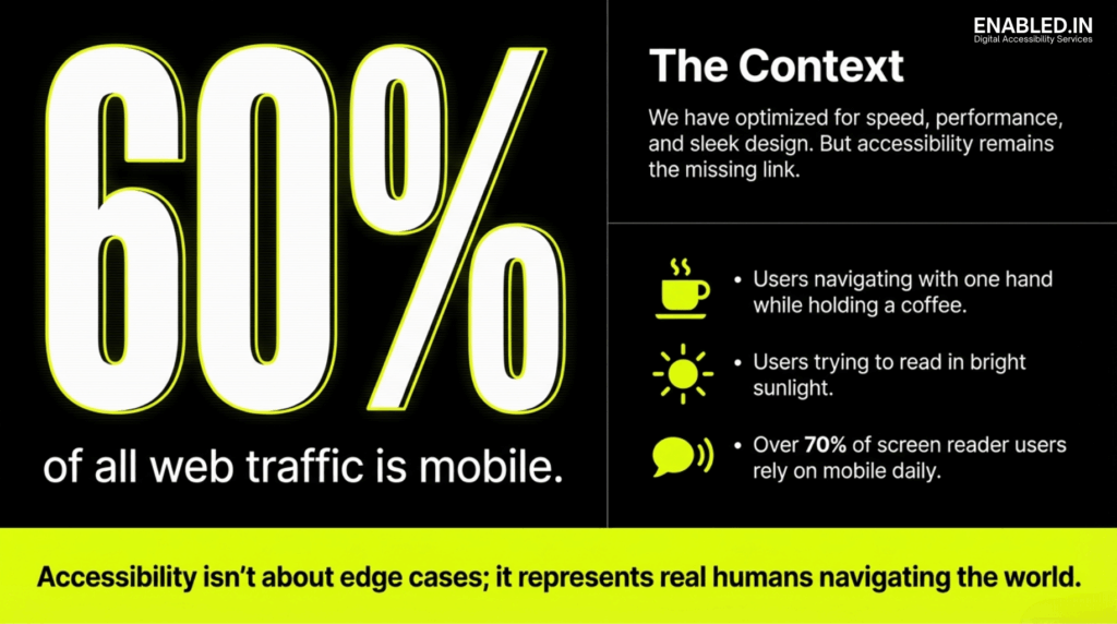
Long Description: Mobile Accessibility Context Graphic
The image is a black and neon-yellow informational graphic emphasizing the importance of mobile accessibility. On the left side, very large bold text reads “60%,” followed by the statement “of all web traffic is mobile.” This highlights the dominant role mobile devices play in accessing the web.
On the right side, a section titled “The Context” explains that while digital products are often optimized for speed, performance, and sleek visual design, accessibility is frequently treated as a missing or secondary consideration.
Below this heading, three illustrated examples describe real-world mobile usage scenarios: users navigating a device with one hand while holding a coffee, users attempting to read content in bright sunlight, and a statement noting that over 70 percent of screen reader users rely on mobile devices on a daily basis.
At the bottom of the graphic, a highlighted banner states: “Accessibility isn’t about edge cases; it represents real humans navigating the world.” The overall message reinforces that mobile accessibility supports everyday users in common situations and is essential for inclusive digital experiences.
Mobile devices are now the primary gateway to the digital world. More than 60% of global web traffic comes from mobile. This makes accessibility on small screens a critical requirement. It is not just an optional enhancement. Mobile Accessibility: From Empathy to Action reframes accessibility as both a human responsibility and a business necessity.
Accessibility is often misunderstood as something that serves only a small minority. In reality, it supports people navigating bright sunlight, noisy environments, one-handed use, temporary injuries, aging-related changes, and cognitive overload. When accessibility is missing, friction appears everywhere.
Accessibility is not about edge cases. It is about real humans navigating real conditions.
Accessibility Begins with Empathy
Designing for Real Human Contexts
Empathy is the foundation of effective mobile accessibility. Users do not interact with apps in perfect conditions. They multitask, commute, hold coffee cups, manage distractions, and adapt to their surroundings.
Empathy-driven design asks:
- Can this app be used with one hand?
- Is content readable in bright sunlight?
- Is critical information available without sound?
- Does the interface remain usable under stress?
When teams design for lived experience instead of ideal scenarios, accessibility issues surface early and clearly.
Permanent, Temporary, and Situational Barriers
Accessibility barriers are not limited to permanent disabilities. A broken arm, a loud train, low battery mode, or poor network access can temporarily create the same challenges. Inclusive design reduces friction across all these scenarios benefiting everyone.
The Four Pillars of Functional Needs for Mobile App Accessibility
Rather than focusing on medical diagnoses, modern accessibility focuses on functional needs how people interact with technology.
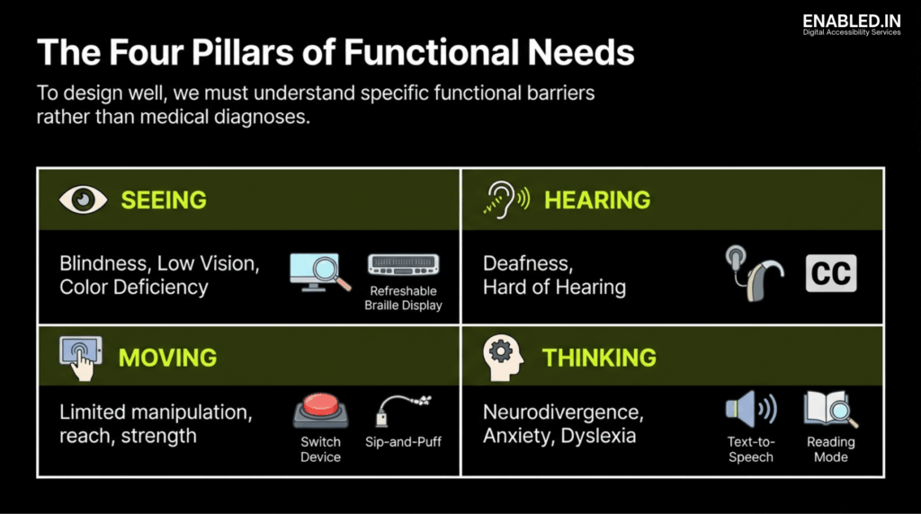
The image is an informational graphic titled “The Four Pillars of Functional Needs,” explaining that effective design focuses on functional barriers rather than medical diagnoses.
The graphic is divided into four sections. The “Seeing” section covers blindness, low vision, and color deficiency, with icons representing screen magnification and refreshable braille displays. The “Hearing” section addresses deafness and hard of hearing, illustrated by hearing aids and closed captions.
The “Moving” section describes limited manipulation, reach, or strength, with icons showing alternative input methods such as switch devices and sip-and-puff controllers. The “Thinking” section includes neurodivergence, anxiety, and dyslexia, represented by text-to-speech and reading mode features.
Overall, the image communicates that inclusive digital design must consider diverse functional needs across vision, hearing, mobility, and cognition.
Seeing: Visual Accessibility
Visual accessibility supports users who are blind, have low vision, or experience color-vision deficiencies. These users rely on screen readers, high contrast, scalable text, and clear semantic structure.
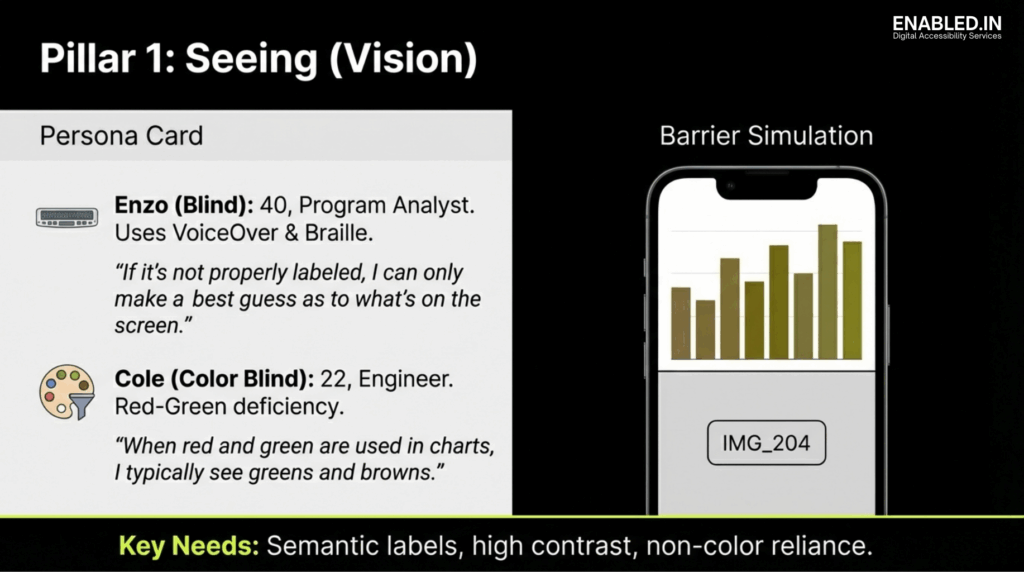
The image is an informational slide titled “Pillar 1: Seeing (Vision)” focusing on visual accessibility needs through persona examples and a mobile barrier simulation.
A persona card introduces Enzo, a blind program analyst who relies on VoiceOver and braille, highlighting the importance of proper semantic labeling. It also introduces Cole, an engineer with red-green color blindness, explaining how color-only charts can be difficult to interpret.
A mobile barrier simulation shows a chart with low color differentiation and an unlabeled image placeholder, illustrating common accessibility failures for blind and low-vision users.
The slide concludes with key needs including semantic labels, high contrast, and avoiding reliance on color alone to convey information.
Key requirements include:
- Programmatic labels
- Sufficient color contrast
- Non-color indicators
- Flexible text resizing
- Predictable layout structure
Hearing: Auditory Accessibility
Auditory accessibility ensures that information is not lost when sound cannot be perceived. Captions, transcripts, and visual or haptic alerts are essential.
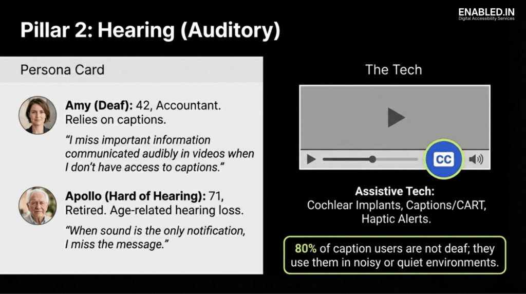
The image is an informational slide titled “Pillar 2: Hearing (Auditory)” focusing on auditory accessibility needs through persona examples and supporting technology.
A persona card introduces Amy, a deaf accountant who relies on captions and explains that she misses important video information without them. It also introduces Apollo, a retired individual who is hard of hearing and may miss messages when sound is the only form of notification.
A technology section shows a video player with a highlighted closed captions control, along with references to assistive technologies such as cochlear implants, captions or CART services, and haptic alerts.
The slide concludes with a statistic noting that 80 percent of caption users are not deaf and use captions in noisy or quiet environments, reinforcing the broad value of auditory accessibility.
Importantly, captions are widely used by people without hearing impairments. They are utilized in noisy, quiet, or shared environments. This makes them a universal accessibility feature.
Moving: Motor and Dexterity Accessibility
Motor accessibility supports users with limited reach, strength, or precision. Small touch targets, gesture-only controls, and unstable interfaces create significant barriers.
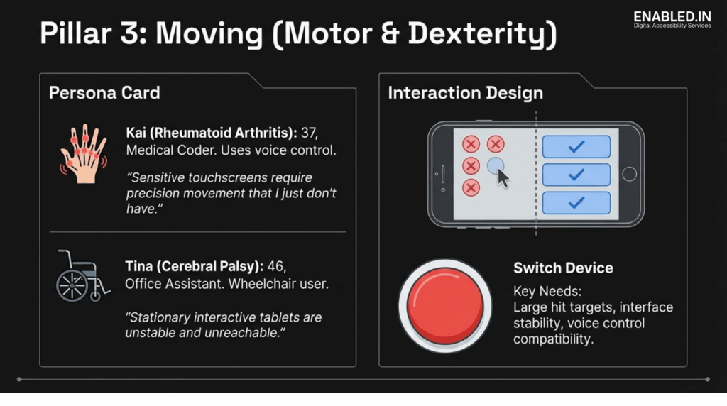
The image is an informational slide titled “Pillar 3: Moving (Motor & Dexterity)” focusing on motor and dexterity accessibility needs through persona examples and interaction design guidance.
A persona card introduces Kai, a medical coder with rheumatoid arthritis who relies on voice control and explains that precise touchscreen interactions are difficult. It also introduces Tina, an office assistant with cerebral palsy who uses a wheelchair and experiences difficulty with unstable or unreachable touch interfaces.
An interaction design section compares small, closely spaced touch targets with larger, well-spaced buttons, illustrating accessible versus inaccessible design patterns.
The slide also highlights the use of switch devices and emphasizes key needs such as large hit targets, interface stability, and compatibility with voice control and alternative input methods.
Effective solutions include:
- Large, well-spaced tap targets
- Reachable primary actions
- Voice and switch device compatibility
- Interface stability
Thinking: Cognitive Accessibility
Cognitive accessibility benefits users with dyslexia, ADHD, anxiety, or neurodivergence. Excessive animations, cluttered layouts, and unpredictable flows increase cognitive load.
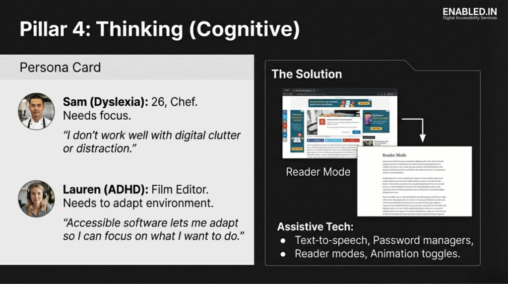
The image is an informational slide titled “Pillar 4: Thinking (Cognitive & Neurological)” focusing on cognitive accessibility needs through persona examples and interface design guidance.
A persona card represents users with dyslexia, anxiety, attention-related challenges, and other forms of neurodivergence, highlighting difficulties with dense text, cluttered layouts, and overwhelming interfaces.
An interface design section illustrates cognitive-friendly patterns such as simplified layouts, clear headings, consistent navigation, and assistive features like text-to-speech and reading mode.
The slide emphasizes key needs including plain language, reduced cognitive load, predictable interactions, adequate time to complete tasks, and optional comprehension supports.
Clear structure, reader modes, reduced motion options, and predictable navigation dramatically improve usability and focus.
Designing with Functional Personas
Functional personas help teams design for lived experience rather than assumptions. These personas represent real barriers users face daily. Users may rely on screen readers, captions, voice control, or reduced motion.
Using functional personas ensures that accessibility decisions are grounded in reality, not theory.
Your Smartphone as an Accessibility Testing Lab
You do not need a specialized lab to test accessibility. Your phone already contains powerful tools to simulate real barriers.
Visual Stress Testing
- Enable grayscale mode to detect color dependency
- Increase text to maximum size to test reflow
- Use dark mode to expose transparency issues
- Test content in bright sunlight
Interaction and Reach Testing
- Use the app one-handed
- Rotate the device to landscape
- Lock orientation and check for horizontal scrolling
- Verify that primary actions remain reachable
Screen Reader Reality Checks
Turn on VoiceOver or TalkBack, close your eyes, and navigate. This quickly reveals:
- Missing labels
- Incorrect focus order
- Unannounced controls
- Confusing interaction patterns
Environment and Cognitive Testing
- Enable airplane mode to test offline feedback
- Reduce motion to check animation dependency
- Mute audio and verify caption accuracy
These tests are not “extra.” They reflect real-world use.
Accessibility as a Strategic and Legal Requirement
Accessibility is no longer just a best practice, it is increasingly a legal obligation, especially in the European market.
European Accessibility Compliance: EAA, EN 301 549, and VPAT
The European Accessibility Act (EAA)
The European Accessibility Act (EAA) establishes mandatory accessibility requirements for digital products and services sold or used in the European Union, including:
- Mobile applications
- E-commerce platforms
- Banking and financial services
- Digital content and consumer software
From June 2025, covered products must be accessible by law. The EAA focuses on outcomes: users with disabilities must be able to perceive, understand, operate, and interact with services independently.
This aligns directly with empathy-led accessibility usability for real humans, not theoretical compliance.
EN 301 549: The Technical Standard for Europe
EN 301 549 is the harmonized European accessibility standard that supports the EAA. It applies to ICT products and services, including mobile apps.
EN 301 549:
- Is closely aligned with WCAG 2.1 Level AA
- Defines measurable accessibility requirements
- Covers mobile interaction, screen readers, contrast, captions, reflow, and cognitive considerations
In practice, a mobile product that genuinely meets WCAG 2.1 AA through real-world testing is largely aligned with EN 301 549.
VPAT: Proving Accessibility with Evidence
Accessibility must be demonstrable. This is where VPAT (Voluntary Product Accessibility Template) documentation becomes critical.
A VPAT:
- Explains how a product meets accessibility standards
- Maps functionality to WCAG and EN 301 549 criteria
- Is commonly required for EU procurement and enterprise sales
A meaningful VPAT is not a checkbox exercise. It reflects:
- Assistive technology testing
- Known limitations and mitigations
- Real user impact
Empathy-based testing strengthens VPAT credibility by ensuring claims reflect actual usability.
Adaptive Design: Building for Flexibility
Users will adapt interfaces zooming, changing colors, enabling assistive tech. Accessible design anticipates this.
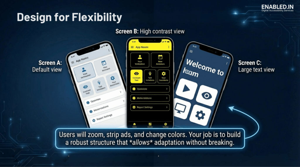
The image is an informational graphic titled “Design for Flexibility” demonstrating how a mobile application adapts to different accessibility settings without losing usability.
Three mobile screens are shown. The first represents a default view with standard text size and colors. The second shows a high-contrast view using dark backgrounds and bright elements to improve visual clarity. The third presents a large-text view with enlarged text and simplified layout for improved readability.
A caption explains that users may zoom, change colors, or simplify interfaces, and emphasizes that accessible design requires flexible layouts that can adapt without breaking functionality.
Adaptive design means:
- Layouts that survive zoom and resize
- Interfaces that remain usable with system settings
- Structures that support customization without breaking
Accessibility is not about control. It is about resilience.
Need an Accessibility audit and testing for Mobile App with VPAT/ACR?
Reader More our Mobile App Accessibility Testing Services
Talk to Our Accessibility Experts
We’re here to help. You might be responding to an RFP. You’re preparing for procurement. Or you could be improving inclusion across your Booking web and mobile app platform.
Contact us today to discuss your Web & Mobile App accessibility audit. Let’s talk about your accessibility requirements. Take the next step toward inclusive, compliant finance systems.
Sathasivam Kannupayan
sathasivam@enabled.in
www.enabled.in
+91 98405 15647
FAQs – Mobile App Accessibility VPAT / ACR
What is mobile accessibility?
Mobile accessibility ensures that mobile apps and websites can be used by people with diverse visual, auditory, motor, and cognitive abilities. It focuses on making content perceivable, operable, understandable, and robust on small-screen devices.
Is accessibility only for people with disabilities?
No. Accessibility benefits everyone, including people in temporary or situational limitations such as bright sunlight, noisy environments, one-handed use, low bandwidth, or aging-related changes.
Why is empathy important in accessibility design?
Empathy helps teams understand real-world user challenges. By designing for lived experiences rather than ideal conditions, accessibility issues are identified earlier and solutions become more practical and effective.
How does the European Accessibility Act (EAA) affect mobile apps?
The European Accessibility Act makes accessibility legally mandatory for many mobile apps and digital services sold or used in the European Union starting June 2025. Covered products must be usable by people with disabilities.
What is EN 301 549 in simple terms?
EN 301 549 is the European technical accessibility standard that explains how digital products and services, including mobile apps, must be designed to meet accessibility requirements.
Is EN 301 549 the same as WCAG?
No. EN 301 549 references WCAG 2.1 Level AA but also includes additional requirements specific to ICT products and services, such as software and mobile platforms.
What is a VPAT and who needs one?
A VPAT (Voluntary Product Accessibility Template) documents how a product meets accessibility standards. It is commonly required for public-sector procurement, enterprise sales, and European market compliance.
Can automated tools ensure accessibility compliance?
No. Automated tools identify only a portion of accessibility issues. Manual testing with assistive technologies and real users is essential for meaningful compliance.
How early should accessibility be considered in product development?
Accessibility should be considered from the earliest design and planning stages. Early integration reduces rework, lowers cost, and improves overall product quality.
Does accessibility slow down product development?
No. When built in early, accessibility improves clarity, reduces defects, and often speeds up development by preventing costly fixes later.
What is the biggest accessibility mistake teams make?
The biggest mistake is treating accessibility as a checklist rather than a user experience problem that requires empathy and real-world testing.
How can small teams start with accessibility?
Small teams can start by using built-in mobile tools such as screen readers, text resizing, grayscale mode, reduced motion settings, and one-handed testing.
Is accessibility a one-time effort?
No. Accessibility requires continuous testing and improvement as products evolve, features change, and user needs grow.