Table of Content
- Homepage and Navigation – Cognitive Accessibility
- Product Search – Cognitive Accessibility
- Product Listing, Filtering and Sorting – Cognitive Accessibility
- Product Detail Page – Cognitive Accessibility
- Product Variant Selection – Cognitive Accessibility
- Product Comparison – Cognitive Accessibility
- Add to Cart – Cognitive Accessibility
- Shopping Cart – Cognitive Accessibility
- Coupons, Discounts and Promotions – Cognitive Accessibility
- Login, Registration and Guest Checkout – Cognitive Accessibility
- Checkout Progress – Cognitive Accessibility
- Address and Customer Information Forms – Cognitive Accessibility
- Re-entering Information – Cognitive Accessibility
- Delivery Selection – Cognitive Accessibility
- Payment – Cognitive Accessibility
- OTP and Authentication – Cognitive Accessibility
- Form Validation and Error Recovery – Cognitive Accessibility
- Payment Failure – Cognitive Accessibility
- Review Before Purchase – Cognitive Accessibility
- Order Confirmation – Cognitive Accessibility
- Order Tracking – Cognitive Accessibility
- Cancellation – Cognitive Accessibility
- Returns and Refunds – Cognitive Accessibility
- Customer Support and Help – Cognitive Accessibility
- Session Timeout – Cognitive Accessibility
- How Enabled.in Helps E-Commerce Teams
Cognitive Accessibility in E-Commerce: Designing Shopping Experiences That Are Easier to Understand
Online shopping should feel simple:
Find → Compare → Select → Add to Cart → Checkout → Pay → Receive
But modern e-commerce journeys can require customers to process large amounts of information, remember previous selections, understand promotions, compare products, complete forms, manage authentication, recover from errors, and make financial decisions.
The goal is not to remove every decision from shopping.
The goal is to remove unnecessary cognitive effort.
A useful question for every e-commerce team is:
Does this shopping experience help the customer complete their task, or does it make the customer spend unnecessary effort figuring out the interface?
What Is Cognitive Accessibility in E-Commerce?
Cognitive accessibility means designing an online shopping experience so customers can more easily:
- understand what they are seeing;
- find products and information;
- maintain attention;
- remember necessary information;
- understand prices and promotions;
- compare choices;
- make decisions;
- complete forms;
- understand errors;
- recover from mistakes;
- understand what will happen after an action; and
- complete a purchase independently.
Cognitive accessibility should therefore be evaluated across the complete shopping journey, not only individual components.
A technically accessible button does not make a confusing checkout process cognitively accessible.
1. Homepage and Navigation
| Area | E-Commerce Example |
|---|---|
| What we commonly see in e-commerce | Homepages may contain hero banners, flash sales, promotional pop-ups, app-download messages, recommendations, chat widgets, newsletter prompts and multiple competing calls to action. |
| Cognitive accessibility problem | Customers have to decide which information deserves attention before they can even begin shopping. |
| What we recommend | Establish a clear hierarchy. Make core shopping functions such as Search, Shop by Category, Account and Cart easy to identify. Keep secondary promotions visually subordinate to primary tasks. |
| Better example | Search products → Shop by category → Featured products → Offers |
| What to avoid | Multiple simultaneous pop-ups, uncontrolled rotating content, competing primary CTAs, ambiguous icons and excessive promotional interruptions. |
| Why it helps | Customers can quickly understand the purpose of the page and identify where to begin. |
| WCAG/W3C consideration | Clear page purpose, understandable controls, predictable navigation and clear structure. |
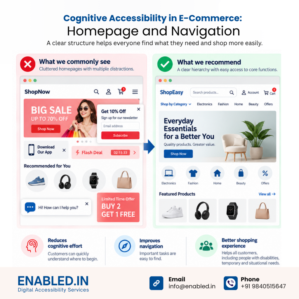
W3C cognitive accessibility guidance specifically recommends making important tasks easy to find and providing clear site and page structures.
2. Product Search
| Area | E-Commerce Example |
|---|---|
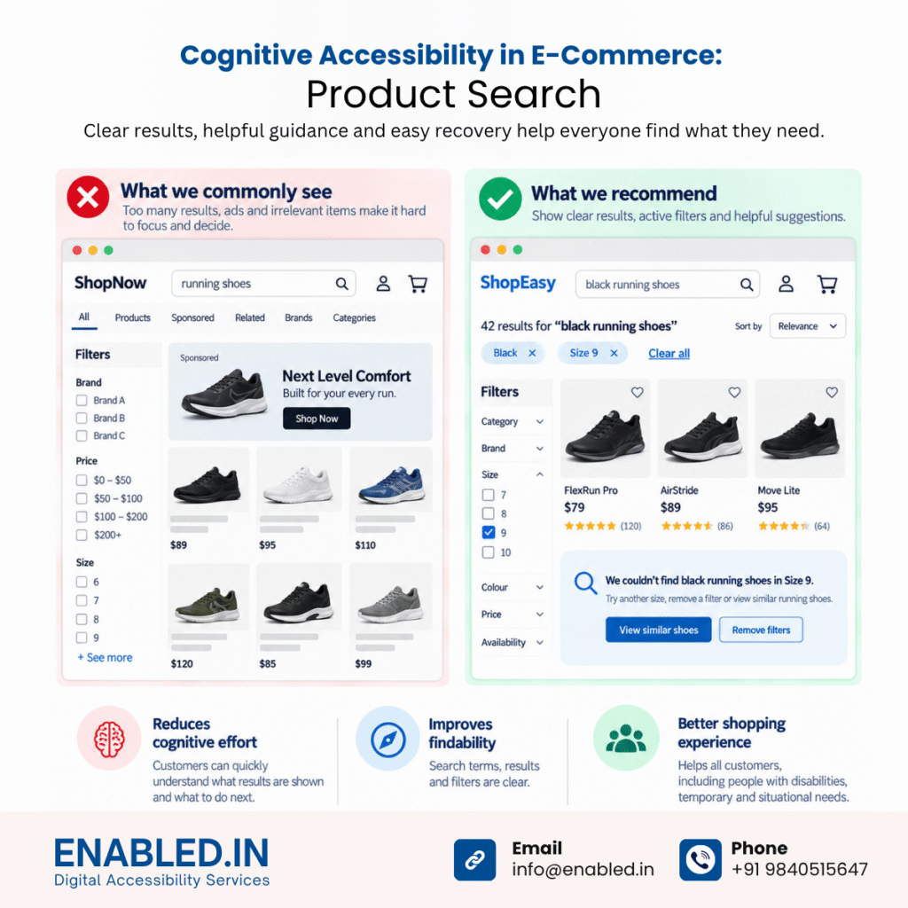
| What we commonly see in e-commerce | Searches may return hundreds of products together with sponsored products, recommendations and alternative categories. Failed searches sometimes provide little more than “No results.” |
| Cognitive accessibility problem | Customers must process too many choices or independently determine why their search failed. |
| What we recommend | Keep the original search term visible. Show the number of results and active filters. Provide spelling support and useful recovery suggestions. |
| Better example | 42 results for “Black running shoes”. Active filters: Black · Size 9 |
| No-results example | We couldn’t find black running shoes in Size 9. Try another size, remove a filter or view similar running shoes. |
| What to avoid | Empty result pages, unexplained failures, unexpected query resets and irrelevant recommendations overwhelming the actual results. |
| Why it helps | Customers understand what the system searched for and what they can do next. |
| WCAG/W3C consideration | Findability, understandable feedback, orientation and recovery. |
3. Product Listing, Filtering and Sorting
| Area | E-Commerce Example |
|---|---|
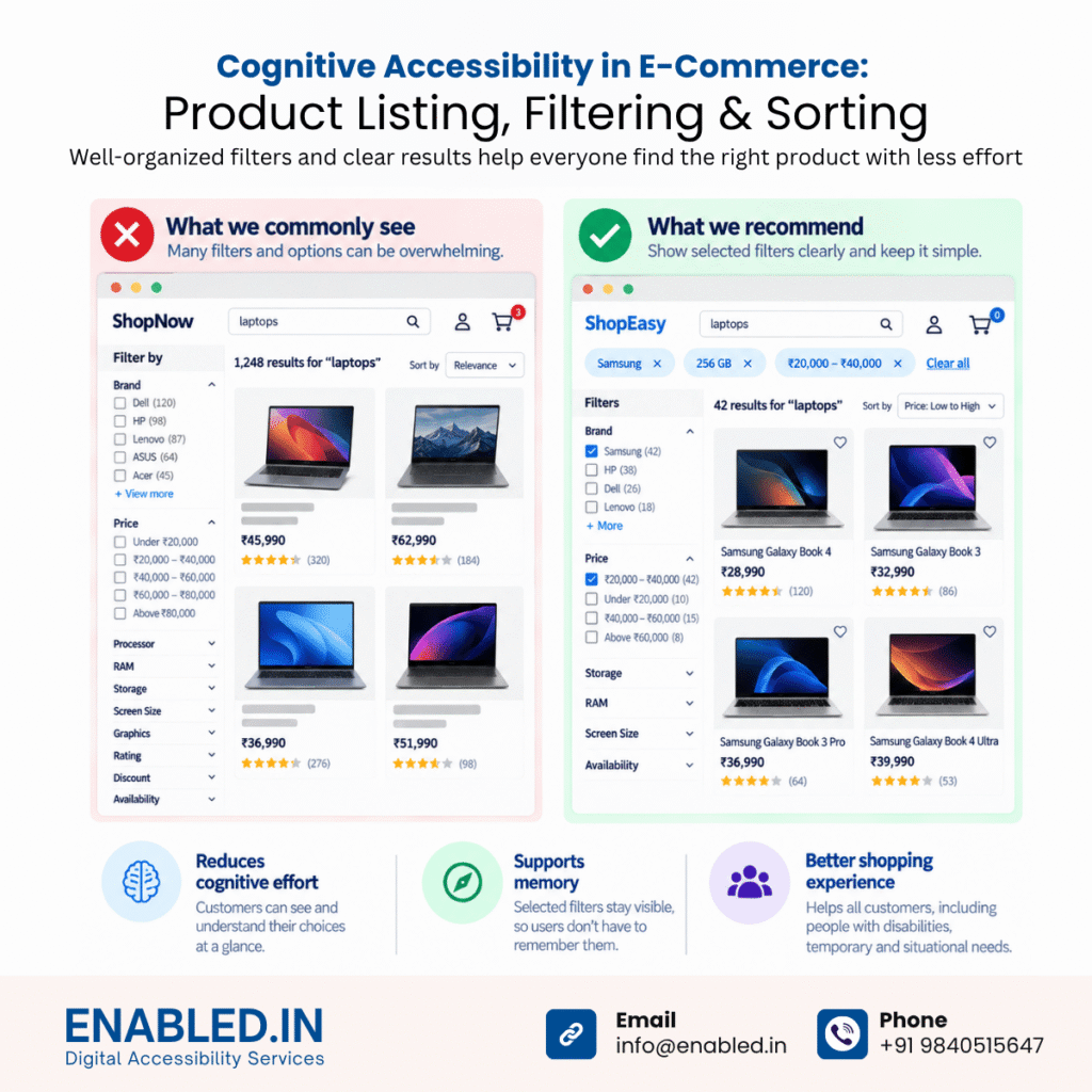
| What we commonly see in e-commerce | Large categories may expose numerous filters for price, brand, colour, size, rating, discount, specifications and availability. |
| Cognitive accessibility problem | Customers have to process many choices and remember which criteria they selected. |
| What we recommend | Group related filters, prioritize important options and make selected filters persistently visible. Preserve selections when customers return from a product page. |
| Better example | Samsung × · 256 GB × · ₹20,000–₹40,000 × followed by Clear all filters |
| What to avoid | Unexpectedly resetting filters, hiding active selections or changing criteria without informing the customer. |
| Why it helps | The interface becomes an external memory aid. Customers can see their decisions rather than remembering them. |
| WCAG/W3C consideration | Memory support, visible state, orientation and predictable interaction. |
4. Product Detail Page
| Area | E-Commerce Example |
|---|---|
| What we commonly see in e-commerce | Product pages may combine descriptions, prices, discounts, coupons, EMI offers, recommendations, reviews, specifications, delivery details and multiple purchase actions. |
| Cognitive accessibility problem | Customers must determine which information is essential before they can make a purchasing decision. |
| What we recommend | Prioritize information according to the customer’s decision journey. Use progressive disclosure for secondary information. |
| Recommended order | Product Name → Price → Rating → Key Features → Variant → Availability → Delivery → Add to Cart → Detailed Specifications → Reviews |
| Better example | Running Shoe XYZ · ₹4,999 · Black · Size 9 · In Stock · Delivery by 21 September · Add to Cart |
| What to avoid | Multiple competing purchase buttons, unclear pricing, hidden delivery information and excessive promotions surrounding the primary action. |
| Why it helps | Customers can understand the product progressively instead of extracting critical information from a crowded interface. |
| WCAG/W3C consideration | Clear content, information hierarchy, comprehension and decision support. |
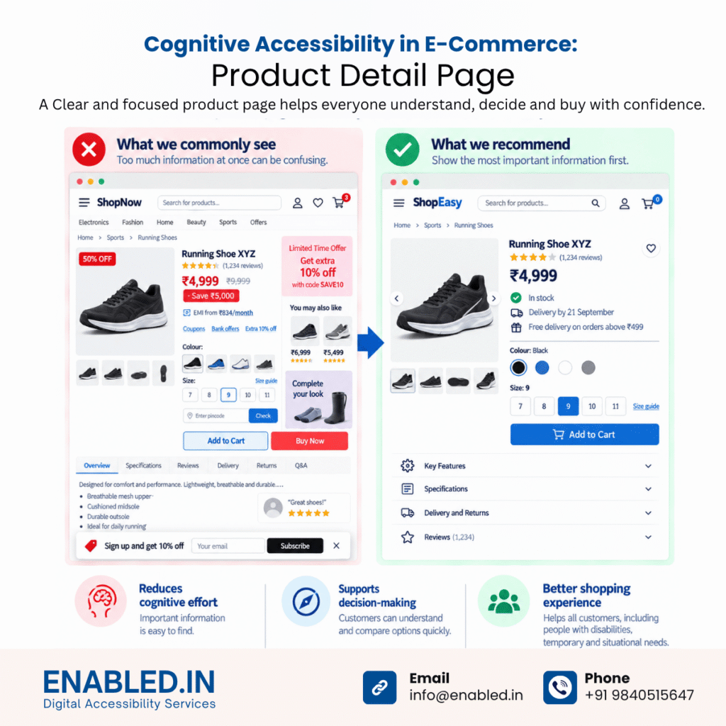
W3C’s supplemental cognitive guidance recommends easy-to-understand language, short blocks of information and clear presentation.
5. Product Variant Selection
| Area | E-Commerce Example |
|---|---|
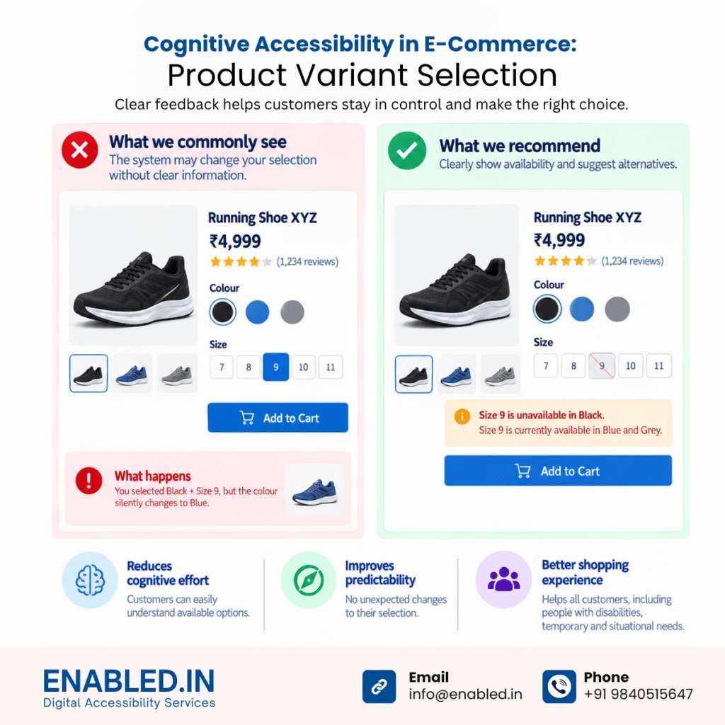
| What we commonly see in e-commerce | Selecting size, colour, storage or another configuration may change availability, images, price or another previously selected option. |
| Cognitive accessibility problem | Customers may not notice that the system changed something they had already selected. |
| What we recommend | Clearly communicate unavailable combinations and alternatives. Do not silently substitute an important customer selection. |
| Poor example | Customer selects Black + Size 9, but Black silently changes to Blue. |
| Better example | Size 9 is unavailable in Black. Size 9 is currently available in Blue and Grey. |
| What to avoid | Silent substitutions, colour-only selection indicators and disabled choices without explanations. |
| Why it helps | Customers remain in control and can understand why the available options changed. |
| WCAG/W3C consideration | Predictability, status communication, clear state and error prevention. |
6. Product Comparison
| Area | E-Commerce Example |
|---|---|
| What we commonly see in e-commerce | Customers often open several product pages or browser tabs and manually compare specifications. |
| Cognitive accessibility problem | Customers must remember information from one product while reviewing another. |
| What we recommend | Provide structured side-by-side comparisons of important attributes. |
| Better example | Compare Price · RAM · Storage · Battery · Warranty · Delivery in consistent rows. |
| What to avoid | Requiring customers to remember specifications across separate pages. |
| Why it helps | It changes the task from recalling information to recognizing information. |
| WCAG/W3C consideration | Memory support and decision assistance. |
W3C cognitive guidance recommends avoiding processes that unnecessarily rely on memory.
7. Add to Cart
| Area | E-Commerce Example |
|---|---|
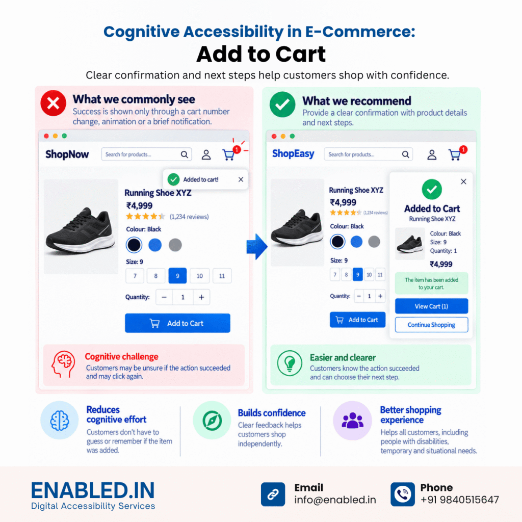
| What we commonly see in e-commerce | After activating Add to Cart, success may primarily be communicated through a cart-number change, animation or temporary notification. |
| Cognitive accessibility problem | Customers may be uncertain whether the action succeeded and may activate it again. |
| What we recommend | Provide an explicit confirmation with enough information to verify the action. |
| Better example | Added to Cart: Running Shoe XYZ · Black · Size 9 · Quantity 1 |
| Next actions | View Cart / Continue Shopping |
| What to avoid | Silent updates or unexpected redirection. |
| Why it helps | Customers know that the action succeeded and understand their next choices. |
| WCAG/W3C consideration | Status communication, predictable interaction and feedback. |
8. Shopping Cart
| Area | E-Commerce Example |
|---|---|
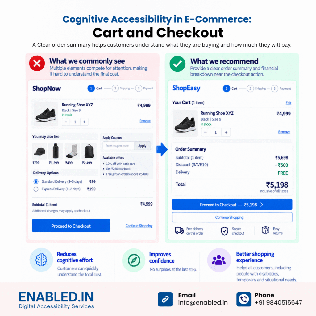
| What we commonly see in e-commerce | Product information, quantity controls, recommendations, coupons, shipping, discounts and totals can all compete for attention. |
| Cognitive accessibility problem | Customers may struggle to determine exactly what they are buying and how much they will pay. |
| What we recommend | Provide a clear order summary and financial breakdown near the checkout action. |
| Better example | Subtotal ₹5,698 → Discount −₹500 → Delivery FREE → Total ₹5,198 |
| Primary action | Proceed to Checkout — ₹5,198 |
| What to avoid | Hidden charges, ambiguous totals and unexpected costs introduced late in checkout. |
| Why it helps | Customers do not need to perform calculations themselves. |
| WCAG/W3C consideration | Comprehension, review and error prevention. |
9. Coupons, Discounts and Promotions
| Area | E-Commerce Example |
|---|---|
| What we commonly see in e-commerce | Customers encounter coupon codes, minimum-spend requirements, card offers, percentage discounts, cashback and exclusions. |
| Cognitive accessibility problem | Customers have to interpret complicated conditions and calculate eligibility. |
| What we recommend | Let the system calculate eligibility and explain the outcome. |
| Poor example | Coupon invalid. |
| Better example | This coupon requires a minimum order of ₹3,999. Add ₹450 more to use it. |
| Success example | SAVE500 applied. You saved ₹500. |
| What to avoid | Generic failures, unexplained exclusions and requiring customers to calculate savings manually. |
| Why it helps | The platform performs unnecessary cognitive work instead of transferring it to the customer. |
| WCAG/W3C consideration | Plain language, error recovery and alternatives to unnecessary numerical demands. |
10. Login, Registration and Guest Checkout
| Area | E-Commerce Example |
|---|---|
| What we commonly see in e-commerce | Customers may encounter sign-in, registration, social login and guest-checkout options before completing a purchase. |
| Cognitive accessibility problem | Customers may not understand whether account creation is mandatory. |
| What we recommend | Where the business model permits guest checkout, make the choice clear and easy to understand. |
| Better example | Checkout as Guest / Sign In |
| What to avoid | Generic Continue buttons when the consequence is unclear. |
| Why it helps | Customers understand the available paths without interpreting business terminology. |
| WCAG/W3C consideration | Clear labels, understandable controls and predictable consequences. |
11. Checkout Progress
| Area | E-Commerce Example |
|---|---|
| What we commonly see in e-commerce | Address, delivery, payment and review may appear across one long page or several screens. |
| Cognitive accessibility problem | Customers may not know where they are, what they have completed or what remains. |
| What we recommend | Organize complex checkout processes into understandable stages and clearly communicate progress. |
| Recommended journey | 1. Address → 2. Delivery → 3. Payment → 4. Review |
| Better example | Step 2 of 4 — Delivery Method |
| What to avoid | Unexplained stages, losing information when navigating backward and unnecessary distractions. |
| Why it helps | Customers can orient themselves without remembering previous steps. |
| WCAG/W3C consideration | Orientation, clear purpose, memory support and predictable processes. |
12. Address and Customer Information Forms
| Area | E-Commerce Example |
|---|---|
| What we commonly see in e-commerce | Checkout forms may request many address, contact and billing fields with inconsistent indications of which are required. |
| Cognitive accessibility problem | Customers must determine what information is required and how it should be entered. |
| What we recommend | Ask only for necessary information. Clearly distinguish required and optional fields and provide meaningful labels and instructions. |
| Better example | Full Name · Mobile Number · Address · Apartment (optional) · City · State · PIN Code |
| What to avoid | Placeholder-only labels, unnecessary fields, unclear formats and clearing completed information after an error. |
| Why it helps | Customers spend less effort interpreting the form. |
| WCAG/W3C consideration | WCAG 3.3 Input Assistance, including labels/instructions, error identification and suggestions where applicable. |
WCAG’s Input Assistance guideline is specifically intended to help users avoid and correct mistakes.
13. Re-entering Information
| Area | E-Commerce Example |
|---|---|
| What we commonly see in e-commerce | Shipping, billing, account and checkout steps may request information already supplied earlier in the process. |
| Cognitive accessibility problem | Customers must remember and re-enter the same information. |
| What we recommend | Auto-populate information or make previously entered information available for selection when WCAG 3.3.7 applies. |
| Better example | ☑ Billing address is the same as delivery address |
| Another example | Display the saved delivery address with Change Address rather than requesting it again. |
| What to avoid | Unnecessarily requesting the same information multiple times. |
| Why it helps | Reduces memory demand, typing effort and potential errors. |
| WCAG/W3C consideration | WCAG 2.2 SC 3.3.7 Redundant Entry — Level A |
WCAG 2.2 requires previously entered information that must be entered again in the same process to be auto-populated or available for selection, subject to specified exceptions.
14. Delivery Selection
| Area | E-Commerce Example |
|---|---|
| What we commonly see in e-commerce | Delivery choices may use labels such as Standard, Express, Priority or Premium. |
| Cognitive accessibility problem | Customers must translate those labels into actual delivery dates and costs. |
| What we recommend | Present the consequence directly with each option. |
| Better example | Standard FREE – Arrives 22–24 September |
| Better example 2 | Express ₹99 – Arrives tomorrow |
| What to avoid | Option A / Option B, unexplained service names or showing the delivery charge only later. |
| Why it helps | Customers compare actual outcomes instead of decoding terminology. |
| WCAG/W3C consideration | Clear language and decision support. |
15. Payment
| Area | E-Commerce Example |
|---|---|
| What we commonly see in e-commerce | Customers may choose between UPI, cards, wallets, net banking, EMI, cash on delivery and other methods. |
| Cognitive accessibility problem | Many choices combined with unclear final actions can create uncertainty at a financially important moment. |
| What we recommend | Group payment methods logically, keep the payable total visible and use a descriptive final action. |
| Poor example | Continue |
| Better example | Pay ₹5,198 |
| What to avoid | Surprise redirects, hidden charges and vague payment actions. |
| Why it helps | Customers understand exactly what the action will do and the amount involved. |
| WCAG/W3C consideration | Clear consequences and error prevention for financial transactions. |
16. OTP and Authentication
| Area | E-Commerce Example |
|---|---|
| What we commonly see in e-commerce | Customers may retrieve and enter an OTP while a countdown timer is running or remember credentials across authentication steps. |
| Cognitive accessibility problem | Authentication can become a memory and attention test. |
| What we recommend | Clearly explain where the code was sent, expected format and recovery options. Allow mechanisms such as password managers and copy/paste where appropriate. |
| Poor example | Enter OTP – 00:48 |
| Better example | Enter the 6-digit code sent to mobile ending 5647. |
| Recovery | Didn’t receive the code? Resend code. |
| What to avoid | Blocking password managers, unnecessary memory tests and unexplained timers. |
| Why it helps | Reduces memory and transcription demands. |
| WCAG/W3C consideration | WCAG 2.2 SC 3.3.8 Accessible Authentication (Minimum) – Level AA |
WCAG 2.2 explicitly recognizes mechanisms such as password-manager support and copy/paste as ways of reducing cognitive burden in authentication.
17. Form Validation and Error Recovery
| Area | E-Commerce Example |
|---|---|
| What we commonly see in e-commerce | Customers may encounter messages such as Invalid input, Something went wrong, or Invalid address. |
| Cognitive accessibility problem | Customers have to diagnose the problem themselves. |
| What we recommend | Explain what is wrong, where the problem occurred and how it can be corrected. Preserve correctly entered information. |
| Poor example | Invalid input. |
| Better example | Enter a 6-digit PIN code. Example: 600001. |
| What to avoid | Generic messages, clearing the whole form and displaying errors far from the relevant field. |
| Why it helps | Error recovery becomes a guided task rather than a problem-solving exercise. |
| WCAG/W3C consideration | SC 3.3.1 Error Identification, 3.3.2 Labels or Instructions and 3.3.3 Error Suggestion. |
18. Payment Failure
| Area | E-Commerce Example |
|---|---|
| What we commonly see in e-commerce | Payment gateways may expose generic failures or technical transaction codes. |
| Cognitive accessibility problem | Customers may not know whether money was taken, whether an order exists or what they should do next. |
| What we recommend | Explain the transaction state and available recovery actions in plain language. |
| Poor example | PG-1038 – Transaction failed. |
| Better example | Your payment wasn’t completed. No order has been placed. Try again or choose another payment method. |
| Actions | Try Again / Choose Another Payment Method |
| What to avoid | Technical codes as the only explanation. |
| Why it helps | Reduces uncertainty during a financially sensitive part of the journey. |
| WCAG/W3C consideration | Error identification, recovery, status communication and clear language. |
19. Review Before Purchase
| Area | E-Commerce Example |
|---|---|
| What we commonly see in e-commerce | Purchase information may be distributed across several checkout steps. |
| Cognitive accessibility problem | Customers must remember earlier selections to identify mistakes. |
| What we recommend | Provide a consolidated review before final purchase. |
| Show | Products · Quantity · Address · Delivery Date · Payment Method · Discounts · Delivery Charges · Total |
| Primary action | Place Order ₹5,198 |
| Editing | Edit Address · Edit Delivery · Edit Payment |
| What to avoid | Finalizing an important financial transaction without an adequate opportunity to verify information. |
| Why it helps | Customers recognize mistakes instead of relying on memory. |
| WCAG/W3C consideration | SC 3.3.4 Error Prevention (Legal, Financial, Data), where applicable. |
WCAG includes specific error-prevention requirements for pages that cause legal commitments or financial transactions.
20. Order Confirmation
| Area | E-Commerce Example |
|---|---|
| What we commonly see in e-commerce | Confirmation pages may immediately introduce recommendations, promotions, loyalty programmes or account creation. |
| Cognitive accessibility problem | Secondary marketing information can compete with the customer’s need to know whether the purchase succeeded. |
| What we recommend | Make successful completion the dominant message before introducing secondary content. |
| Better example | Order placed successfully. Order #EN123456 · Total paid ₹5,198 · Delivery expected 21 September. |
| Next actions | Track Order / View Order Details |
| What to avoid | Promotions being more prominent than confirmation. |
| Why it helps | Customers immediately know the task is complete. |
| WCAG/W3C consideration | Clear status, confirmation and reduced uncertainty. |
21. Order Tracking
| Area | E-Commerce Example |
|---|---|
| What we commonly see in e-commerce | Logistics terminology or abbreviations may appear in customer-facing tracking systems. |
| Cognitive accessibility problem | Customers have to understand internal terminology. |
| What we recommend | Translate operational statuses into familiar customer language and present them chronologically. |
| Poor example | FC → LH → OFD |
| Better example | Order Confirmed → Packed → Shipped → Out for Delivery → Delivered |
| Current status | Out for delivery Expected today before 8 PM. |
| What to avoid | Internal codes and unclear progress indicators. |
| Why it helps | Customers understand where their order is without learning the retailer’s logistics terminology. |
| WCAG/W3C consideration | Plain language, orientation and predictable progress. |
22. Cancellation
| Area | E-Commerce Example |
|---|---|
| What we commonly see in e-commerce | Confirmation dialogs frequently use generic actions such as Yes / No or Confirm / Cancel. |
| Cognitive accessibility problem | Customers have to remember what question they are answering and what each button will do. |
| What we recommend | Put the actual consequence into the message and action labels. |
| Poor example | Are you sure? Yes / No |
| Better example | Cancel this order? ₹5,198 will be refunded to your original payment method. |
| Actions | Keep Order / Cancel Order |
| What to avoid | Ambiguous actions, particularly for destructive or financially significant operations. |
| Why it helps | Customers can understand the consequence at the point of decision. |
| WCAG/W3C consideration | Clear labels, predictable consequences and error prevention. |
23. Returns and Refunds
| Area | E-Commerce Example |
|---|---|
| What we commonly see in e-commerce | Returns can involve item selection, return reasons, pickup, refund methods and several tracking states. |
| Cognitive accessibility problem | Customers have to remember previous choices and determine what happens next. |
| What we recommend | Convert the return into a guided, understandable workflow with persistent progress information. |
| Recommended journey | Select Item → Return Reason → Pickup → Refund Method → Review → Confirm |
| Confirmation example | Pickup: 21 September · Refund: ₹4,999 · Refund to original payment method |
| Tracking | Return Requested → Picked Up → Received → Refund Initiated → Refund Completed |
| What to avoid | Internal status codes and unnecessary repeated information entry. |
| Why it helps | The system carries the memory and progress burden for the customer. |
| WCAG/W3C consideration | Memory support, redundant entry, status communication and clear processes. |
24. Customer Support and Help
| Area | E-Commerce Example |
|---|---|
| What we commonly see in e-commerce | Help may be distributed across FAQ pages, chatbots, order pages, email, phone and contact forms. |
| Cognitive accessibility problem | Customers may have to search extensively just to determine how to get assistance. |
| What we recommend | Keep repeated help mechanisms consistently located and organize support around recognizable customer problems. |
| Better example | Track My Order · Payment Problem · Cancel an Order · Return an Item · Contact Customer Support |
| What to avoid | Endless chatbot loops, ambiguous support categories and moving help mechanisms between pages. |
| Why it helps | Customers recognize their problem rather than having to understand the retailer’s internal support structure. |
| WCAG/W3C consideration | WCAG 2.2 SC 3.2.6 Consistent Help – Level A, where its conditions apply. |
WCAG 2.2 requires qualifying help mechanisms that repeat across pages to occur in the same relative order. W3C’s broader cognitive guidance also recommends making help easy to obtain.
25. Session Timeout
| Area | E-Commerce Example |
|---|---|
| What we commonly see in e-commerce | Authentication, checkout or payment sessions may expire after a period of inactivity. |
| Cognitive accessibility problem | Customers can lose their progress and may have to repeat information or decisions. |
| What we recommend | Where technically and securely possible, provide advance warning, explain the consequence, allow additional time and preserve entered information. |
| Poor example | Session expired. Start again. |
| Better example | Your checkout session will expire in 2 minutes. Need more time? Continue Session |
| What to avoid | Silent expiration and unnecessary loss of customer information. |
| Why it helps | Reduces time pressure, repeated effort and memory demand. |
| WCAG/W3C consideration | WCAG requirements concerning enough time, together with cognitive accessibility guidance around memory and task completion. |
How Enabled.in Helps E-Commerce Teams
Contact : info@enabled.in
Phone: +91 9840515647
E-commerce accessibility requires more than scanning a homepage and checkout page.
Enabled.in evaluates accessibility across the complete customer journey, including product discovery, decision-making, authentication, transactions and post-purchase experiences.
Our accessibility assessment can cover:
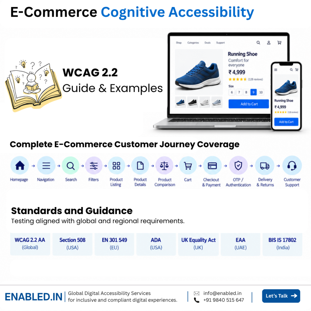
Homepage → Navigation → Search → Filters → Product Listing → Product Details → Product Comparison → Cart → Coupons → Registration → Checkout → Forms → Delivery → Payment → OTP/Authentication → Error Recovery → Confirmation → Tracking → Cancellation → Returns → Refunds → Customer Support
Depending on project requirements, the testing approach can combine:
Automated Testing + Expert Manual Testing + Keyboard Testing + Assistive Technology Testing + Mobile Accessibility Testing + Real-User Testing with Persons with Disabilities + Remediation Validation
Testing can be aligned with applicable requirements such as WCAG 2.2 AA, Section 508, EN 301 549, and relevant regional requirements, while W3C cognitive accessibility guidance can help teams address usability needs that extend beyond minimum conformance.
The objective is not simply to make individual pages technically compliant.
It is to help create a shopping journey that people can find, understand, operate, complete and recover from independently.
Discover more from Enabled.in
Subscribe to get the latest posts sent to your email.